Digital brand identity.


We were invited to Spain.info redesign pitch, the official tourism portal for Spain.
This is our proposal, designed from user experience basics translated into high-end applied graphic solutions.
WELCOME TO THE NEW
spain.info
Mobile first.
The Journey starts here.
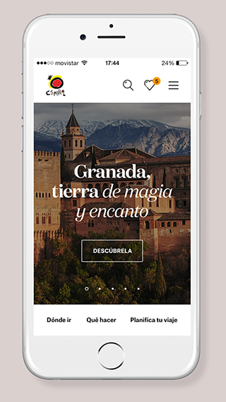
As of May 2017, most of the webpage visits come from mobile devices.
The new Spain.info design follows the mobile first philosophy, ensuring an optimal navigation experience in any screen or device.

Liquid Modular Design.
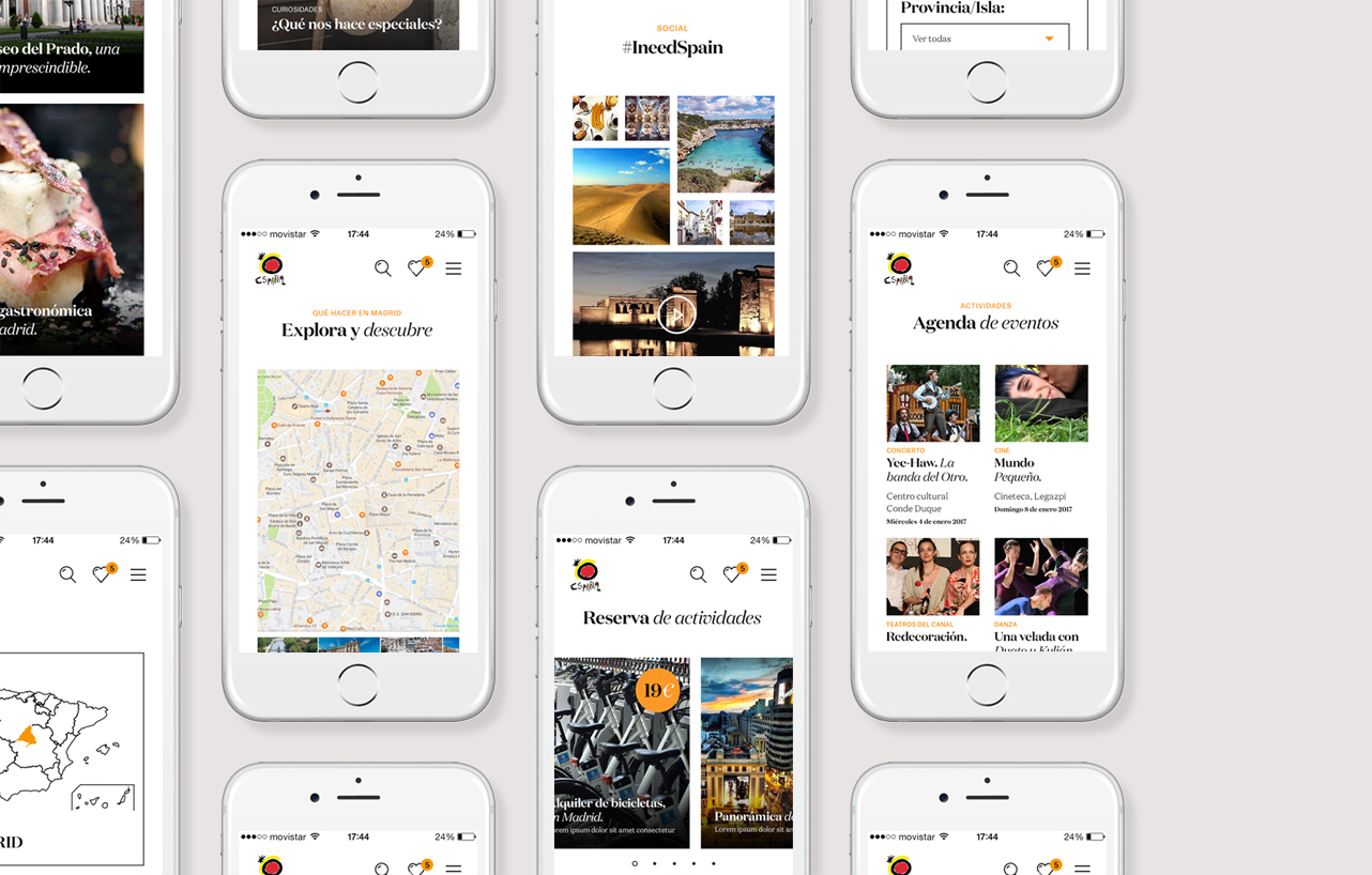
The responsive, modular design, facilitates content management and updates, allowing fast seasonal updating resulting in a richer experience for the user.

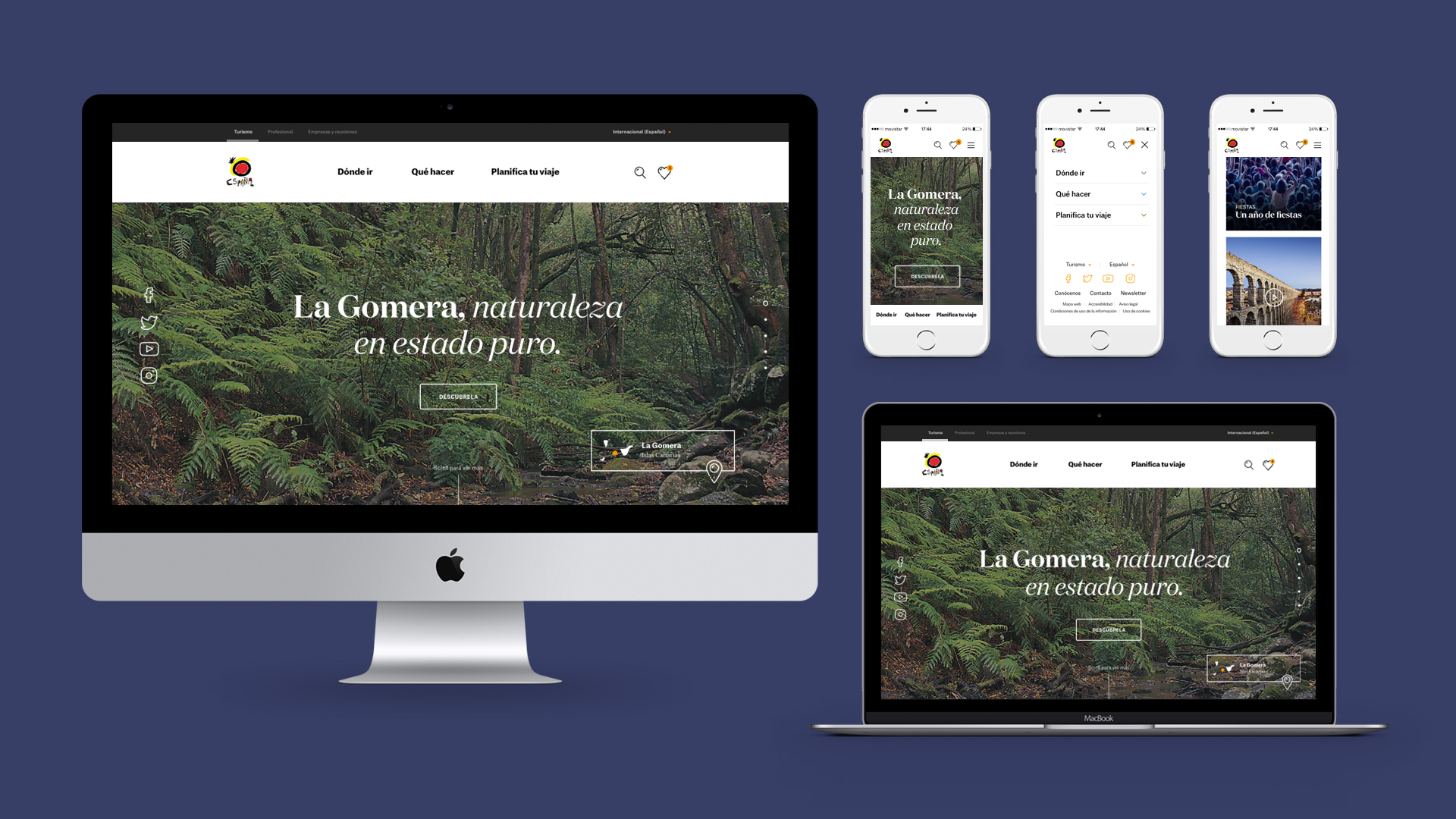
Impressive Everywhere.
Browsing on mobile is different than doing it on desktop. We designed the mobile experience for fast and casual browsing, focusing on content social media style.

Header / Mobile
Simple, useful, accesible.
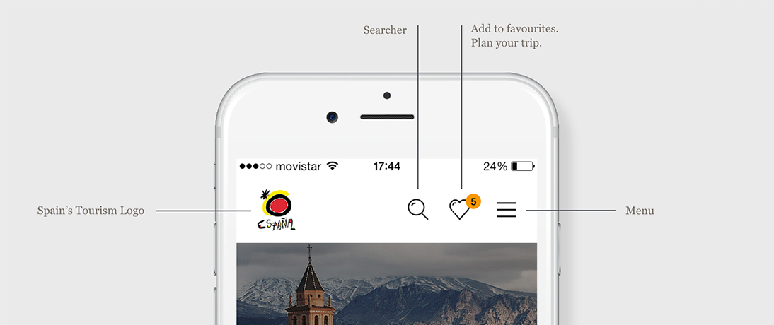
Specially adapted for mobile browsing, fully functional while discreet, so users can focus on content.

Header / Menu
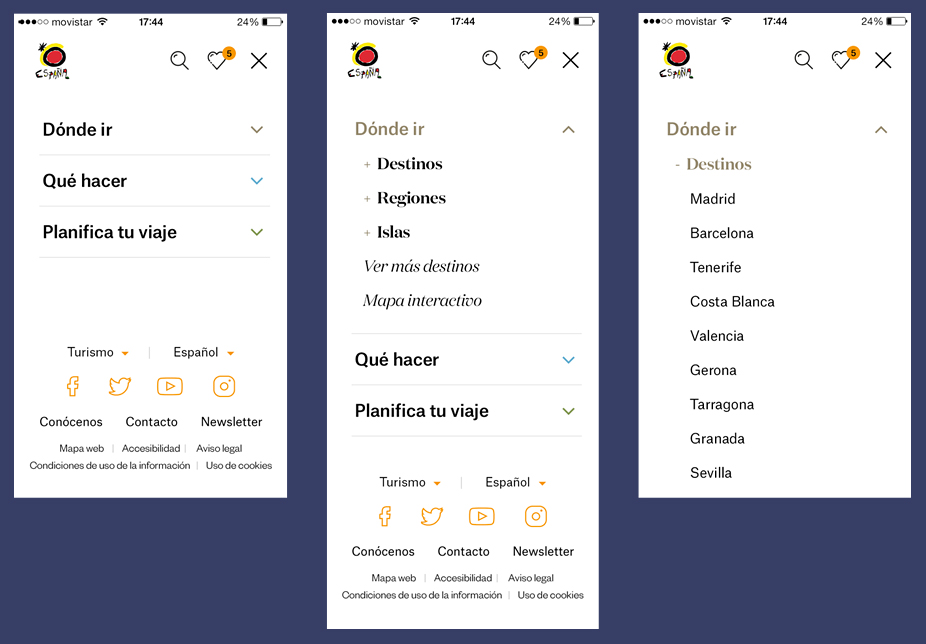
One of the biggest issues to adress was to arrange the many options spain.info offers to the traveler. A dedicated space and a parent-child structure made the trick.

Typography
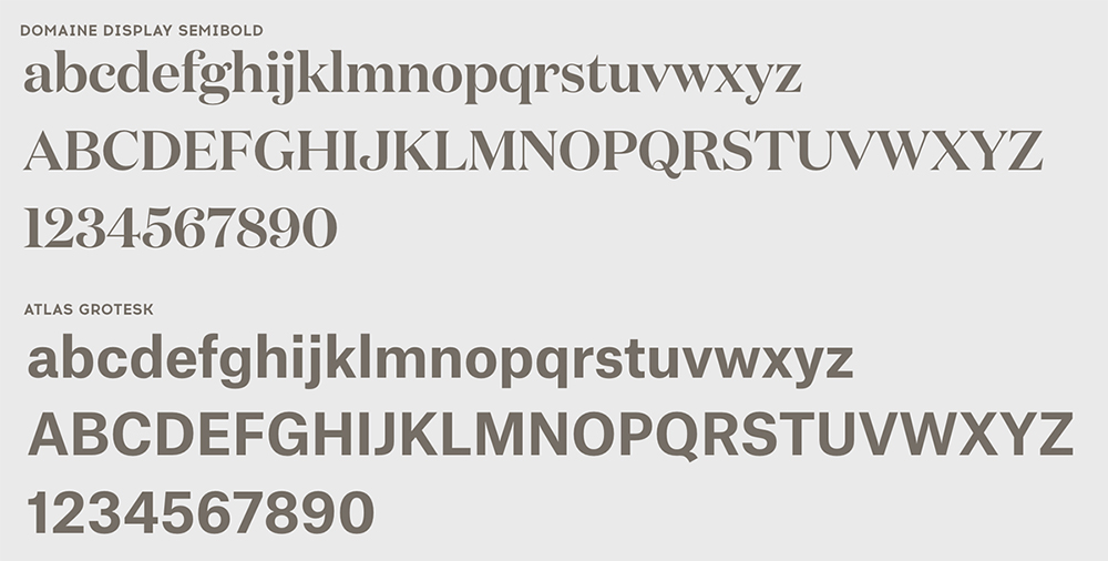
We used a combination of two typographies, sans and serif, to focus on the readability and to have a strong and unique personality.

Iconography
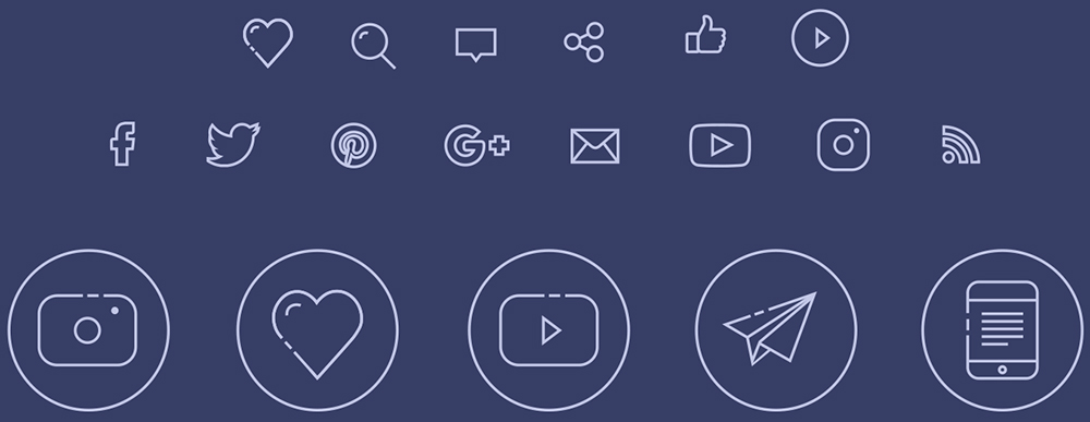
A new icon library was specifically developed for the occasion, looking for simplicity and easy interpretation.

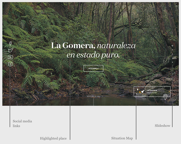
Hero image.
Either on mobile or desktop, we wanted content to be king. The most visual space for stunning images, videos, or seasonal material.


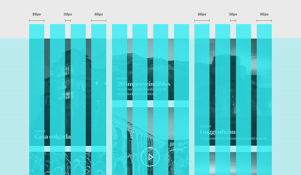
Grid / Layout
In Mobile, content adapts to full screen. For desktop we used a responsive grid to organise the content in a pleasant and visual way.

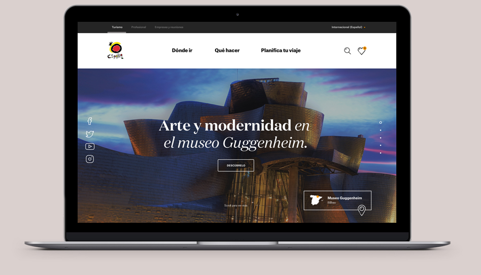
A visual identity created for the times to come, with infinite content possibilities, and ready to for the multi-screen world we live in.

TECHNICAL TEAM
Full Circle Karma:
Hugo Olivera, Sigfrid Mariné, Jaume Leis.
Art direction:
Plácido Salazar, Jaume Leis.
