

CREATING A BRAND LIKE NO OTHER
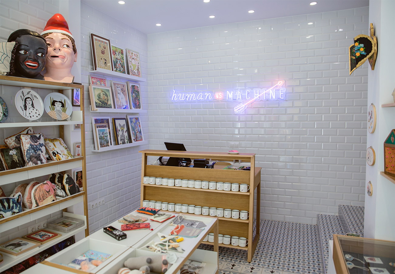
Like none of the thousands that sell the same shirt, teddy bear or lifestyle all over the world. A brand that only sells unique, handmade objects in a small, half-hidden shop in Sant Cugat del Vallès. A brand we have crafted from scratch.
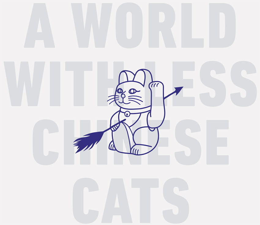

Few things are new. Few things are unique. Few things are special.
This is the reality today, and Florencia Cao wanted to change it. She dreams of a world where objects do not travel in containers and human talent is celebrated amid all the copy-paste in the world.
We wanted to help her turn this dream into a project: a shop where people can find what they were not looking for, objects with a real life span, items as unique as the artists who made them.

DESIGNING THE REVOLUTION
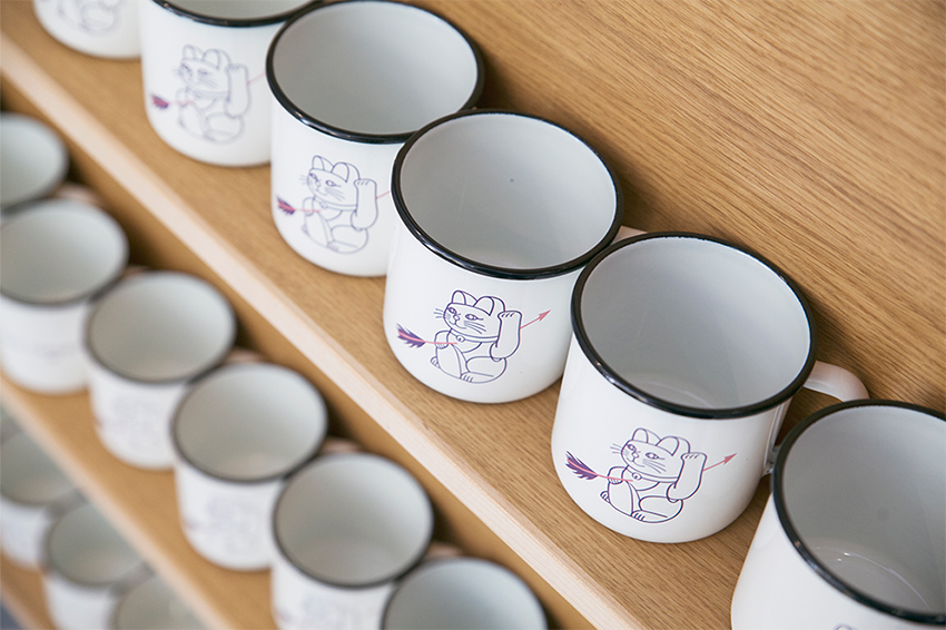
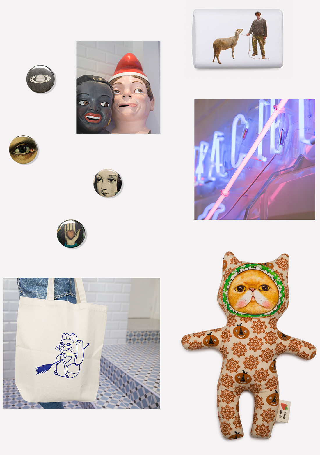
The logo visually expresses the human-robot conflict and the position the brand takes using two types of fonts: a manual one and a standard computer font. The latter is crossed out with an arrow, an element used to convey defeat. As part of the brand’s identity, we also designed and crossed out iconic elements that represent this era of mass production and go against Human vs Machine’s purpose.
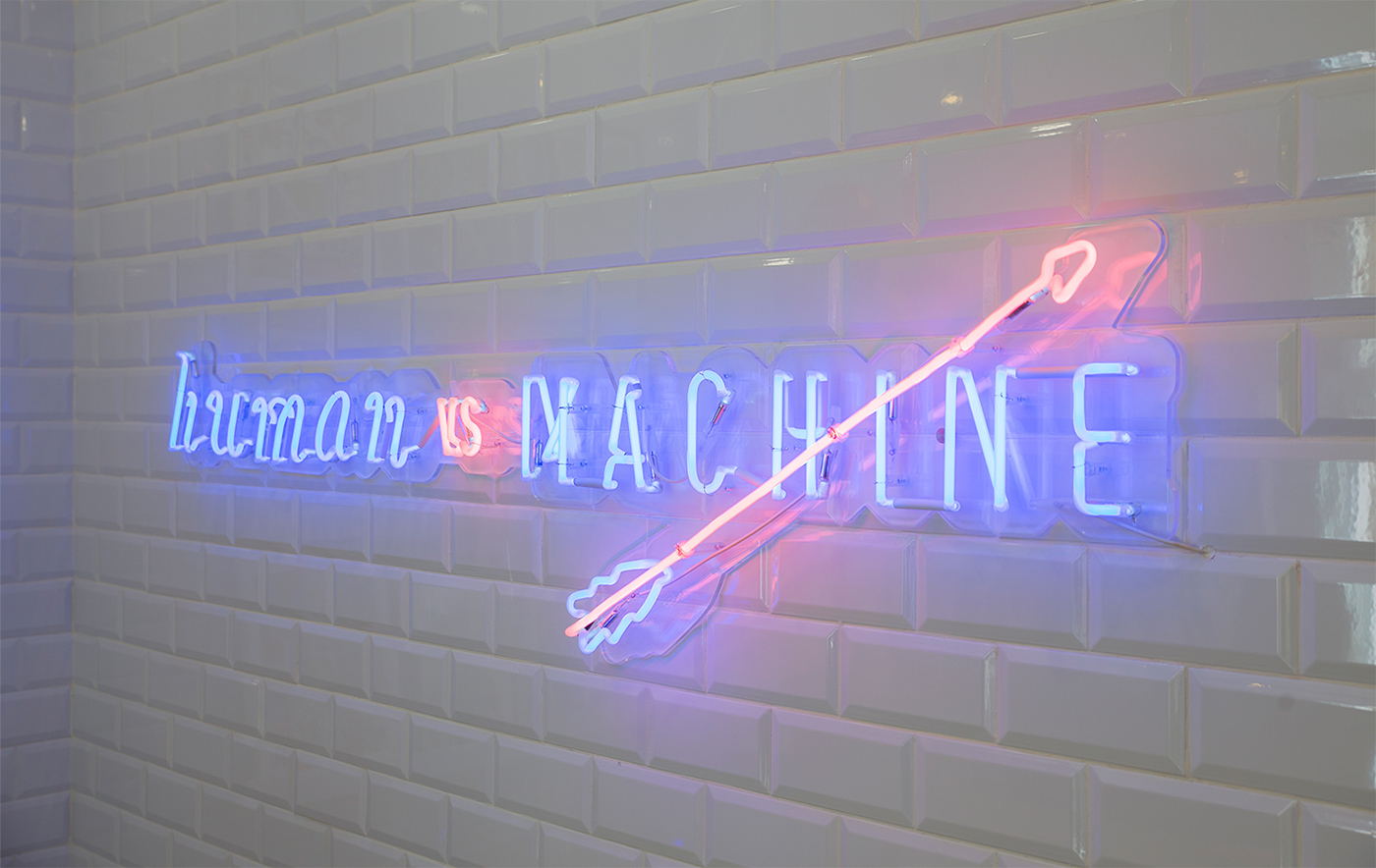


As part of the brand’s identity, we also designed and crossed out iconic elements that represent this era of mass production and go against Human vs Machine’s purpose.



CLIENT
Florencia Cao
CREATIVE DIRECTION
Lean R., Hugo Olivera, Jaume Leis
ART DIRECTION
Jaume Leis, Javier Fernández
COPYWRITING
Enya Murphy
PRODUCER
Aïda Vendrell
